How to create a Beeswarm Plot without coding
You need to visualize distribution analysis, and you know a Beeswarm Plot is the perfect chart for the job.
But when you try to make one in traditional tools like Excel, you realize it is almost impossible, requiring custom scripts and a lot of tweaking. You waste hours looking for tutorials or templates, only to end up with a static image that you can't interact with.
You need a better way.
The problem with traditional tools
The Beeswarm Plot is often treated as an "advanced" feature in traditional BI tools, creating unnecessary barriers for analysts who want to create effective visualizations. You can find plugins or add-ons that allow you to create a Beeswarm Plot in Excel or other BI tools, but these come with their own set of problems, such as complex setup, licensing costs, and compatibility issues. Even if you manage to get it working, the result is often a static image that lacks interactivity and polish.
Why Excel Falls Short for Beeswarm Plot
Creating a Beeswarm Plot in Excel is a nightmare for several reasons:
- Formatting: Most of your time is spent trying to reshape your data into the specific format that Excel requires for that chart type. This often involves creating multiple helper columns, pivot tables, and manual calculations that can take hours to set up correctly.
- Lack of Native Support: Excel either doesn't support Beeswarm Plots at all, or provides such limited functionality that the result looks amateurish and lacks the visual impact you need.
- Poor Customization and Interactivity: When your data changes, you have to manually update everything. There's no automated refresh, meaning you're constantly rebuilding charts. Adjusting colors, labels, sizes, and styling in Excel is cumbersome and often produces inconsistent results.
- Performance Issues: Large datasets cause Excel to lag or crash entirely when attempting to render complex visualizations.
So, you try a plugin?
Excel seems to push users towards third-party plugins or add-ons to create advanced visualizations, but these bring their own set of problems.
For example the cost of quality visualization plugins can be prohibitive, often costing hundreds or thousands of dollars per user per year. Even if you can afford it, compatibility issues arise frequently, with plugins breaking after Excel updates, not working on Mac versions, or being unavailable for Excel Online. Corporate IT departments often block plugin installations due to security policies, leading to vendor lock-in where your visualizations become dependent on a specific tool that may be discontinued. Additionally, each plugin has its own unique interface, terminology, and quirks that you need to learn, creating a steep learning curve for users who just want to create effective visualizations without the hassle.
Obvsiously the integrated environments of BI tools like Looker, Power BI, and Tableau are good alternatives to Excel, but they also treat advanced chart types as "power user" features that require coding or complex setup, creating unnecessary barriers for analysts who want to create effective visualizations.
So, you try coding?
Let's say you decide to learn Python or R to create better visualizations. While this can be a powerful option, it comes with its own set of challenges.
You need to learn programming syntax, data structures, library functions, and debugging techniques—skills that take months or years to develop. The environment setup can be a nightmare, with issues around installing Python/R, managing virtual environments, dealing with package version conflicts, and troubleshooting installation errors. What should take 5 minutes can turn into hours of Googling error messages and Stack Overflow threads. Once you have something working, you face a maintenance burden as code breaks when libraries update, requiring constant maintenance and refactoring. Additionally, non-technical team members can't modify, update, or recreate your visualizations without you, and the context switching between your analysis tool and a code editor disrupts your workflow and thinking process.
Why the Beeswarm Plot is worth the effort
A Beeswarm Plot is a type of scatter plot that displays individual data points along a single axis, with points arranged to avoid overlap. This visualization is particularly useful for showing the distribution and density of data points in a dataset.
How to Create a Beeswarm Plot in Datastripes
Datastripes is designed to democratize data visualization and make it easy for anyone to create stunning, interactive charts like the Beeswarm Plot without any coding or complex setup. Here's how it works:
The Simple, Intuitive Process
1. Upload Your Data
Start by uploading your data file. You can drag and drop CSV, Excel, JSON files, or even copy-paste from Google Sheets directly into the browser. No account is required for basic use, and your data is processed locally in your browser for maximum privacy and security.
Datastripes automatically handles different file encodings (UTF-8, Latin-1, etc.), various delimiters (commas, semicolons, tabs, pipes), messy headers and inconsistent formatting, mixed data types within columns, and date formats from around the world. This means you can get your data ready for visualization without any manual cleanup or formatting headaches.
2. Intelligent Auto-Detection
Once your data is uploaded, our smart engine analyzes its structure and automatically identifies column types (numeric, categorical, temporal, geospatial), detects relationships and correlations between variables, suggests the optimal columns for your Beeswarm Plot based on data characteristics, handles missing values and data quality issues gracefully, and recognizes common patterns and data structures. This intelligent auto-detection saves you time and ensures that your visualization is based on the most relevant data.
3. Select Your Chart Type
Next, select Beeswarm Plot from our curated library of 100+ professional visualization types. Each chart type in our library includes a live preview showing exactly what it looks like with sample data, clear guidance on when it's most appropriate to use, a visual explanation of what data structure it requires, and examples of insights it can reveal. This helps you choose the right visualization for your specific analytical needs.
4. Instant Live Preview
As you make adjustments, see your Beeswarm Plot render in real-time. There's no compile step, no waiting, and no refresh button. Every change—whether you're switching columns, adjusting filters, or tweaking styling—reflects immediately in the preview. This instant feedback loop allows you to iterate quickly and find the perfect visualization for your data.
5. Comprehensive Customization
Fine-tune every aspect of your visualization with our intuitive controls. You can choose from professionally designed color palettes, including color-blind friendly options, brand-specific themes, and custom colors. Add titles, axis labels, data labels, custom annotations, and explanatory text to provide context. Adjust axis scales (linear, logarithmic), set min/max ranges, and enable auto-scaling for optimal data representation. Customize tooltips to show specific information when users hover over data points. Position, style, and configure legends for clarity. Control text sizes, families, weights, and styling for better readability. Set dimensions for different display contexts (desktop, mobile, presentation) to ensure your visualization looks great everywhere.
6. Interactive Exploration Your Beeswarm Plot isn't just a static image—it's a fully interactive data exploration tool. You can hover over any element to see exact values, percentages, and related information. Click on legend items or data points to filter the view and focus on specific subsets. For large or detailed visualizations, zoom in on areas of interest and pan around. Toggle different data series to reduce visual clutter and focus on what matters. Apply filters and transformations on the fly without recreating the chart, allowing you to explore your data from multiple angles with ease.
No plugins required. No coding needed. No complex data transformations. Just instant, professional-quality insights that you can explore interactively.
Bring your Beeswarm Plot anywhere with Datastripes
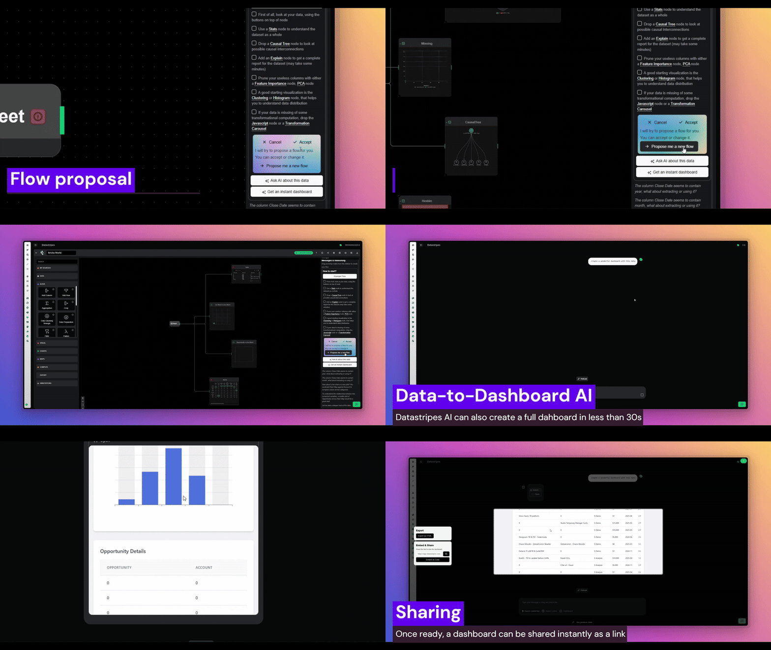
Once your Beeswarm Plot looks perfect, you have multiple professional export options that fit any workflow.
PowerPoint / Presentation Export
Export directly to an editable PowerPoint or Google Slides presentation. Unlike crude screenshot paste-jobs, this export includes fully editable chart elements (you can adjust colors, labels, etc. in PowerPoint), linked data tables for reference and validation, preserved formatting and styling, high resolution optimized for both screens and printing, and notes and annotations carried over.
Interactive Web Link
Share a live, interactive URL that allows viewers to explore the data by hovering, clicking, and filtering; apply their own custom filters and views; download the underlying data in their preferred format; export their own customized versions; and access from any device without installing software. The link remains live and can be updated by you at any time, so stakeholders always see the latest version.
Embed Code for Websites
Get a simple iframe snippet to embed your Beeswarm Plot directly into company websites and marketing pages, internal documentation and wikis, Notion, Confluence, or SharePoint pages, blog posts and articles, and customer-facing dashboards. The embedded chart is fully interactive and updates automatically when you update the source.
Key scenarios for Beeswarm Plot
A Beeswarm Plot is particularly effective in specific analytical scenarios where other chart types fall short. For example, it excels in Distribution analysis Analysis, where it helps you understand complex patterns, relationships, and distributions that simpler charts like bar graphs or line charts cannot convey effectively. It is also ideal for Comparative Multi-Dimensional Analysis, allowing you to compare multiple categories, time periods, or segments simultaneously and see how they relate to each other. Additionally, the visual nature of Beeswarm Plots makes them perfect for Pattern Recognition and Anomaly Detection, as they make patterns, clusters, outliers, and anomalies immediately apparent to the human eye in ways that tables of numbers never can. Finally, they are a powerful tool for High-Impact Stakeholder Presentations, providing a visually compelling and professional way to communicate complex insights to executives, clients, or board members who don't have time for detailed explanations.
How different professionals leverage Beeswarm Plots
You'd probably have seen Beeswarm Plots in action in various industries and roles. But let's dive into some real-world use cases we came up with:
Business Analysts:
- Tracking and visualizing KPIs across multiple dimensions simultaneously
- Creating executive dashboards that tell a story at a glance
- Performing market segmentation analysis and customer clustering
- Analyzing competitive positioning and market share dynamics
- Presenting quarterly business reviews with visual impact
Data Scientists:
- Exploratory data analysis (EDA) to understand data structure before modeling
- Communicating complex model results to non-technical stakeholders
- Visualizing feature importance and model performance metrics
- Presenting A/B test and experimentation results
- Showing distributions and correlations that inform model selection
Product Managers:
- Mapping and optimizing user journeys through product features
- Tracking feature adoption rates across user segments
- Visualizing conversion funnels and identifying drop-off points
- Presenting sprint retrospectives and roadmap priorities
- Analyzing usage patterns to inform product decisions
Marketing Teams:
- Visualizing multi-channel campaign performance and attribution
- Analyzing customer acquisition funnels across different channels
- Presenting ROI and budget allocation recommendations
- Tracking customer segmentation and lifetime value
- Monitoring brand awareness and sentiment metrics
Financial Analysts:
- Visualizing revenue waterfalls and variance analysis
- Presenting budget vs. actuals with clear visual breakdowns
- Analyzing cost structures and profit margins
- Tracking financial KPIs across business units
- Communicating investment performance to stakeholders
Operations Managers:
- Visualizing supply chain flows and bottlenecks
- Analyzing resource utilization and capacity planning
- Tracking quality metrics and defect rates
- Presenting efficiency improvements and process optimizations
- Monitoring logistics and distribution networks
Discover more of these underrated chart types and learn when to use each one in our comprehensive blog series on advanced visualizations.
Start in Under 30 Seconds
- Visit Datastripes
- Drag your data file into the browser
- Select Beeswarm Plot from the chart library
- Customize and export
That's it. You'll go from raw data to presentation-ready visualization faster than Excel even opens.
Create your Beeswarm Plot now and experience how easy advanced charts can be.
Your data deserves better than Excel. Your insights deserve to be seen. Your time deserves to be valued.
Start visualizing smarter today.