10 Underrated Chart You Should Use in 2026
Charts are the core of Data Understanding
Data visualization is an art and a science. While bar charts and line graphs are workhorses, there's a whole world of powerful, insightful charts that often get overlooked. At Datastripes, we believe in unlocking the full potential of your data, and that means going beyond the basics.
Here are 10 underrated charts that can bring new dimensions to your data storytelling, along with a glimpse into how Datastripes helps you create them effortlessly.
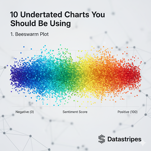
1. Beeswarm Plot
Forget overlapping points in a jittered scatter plot. A beeswarm plot arranges discrete data points so they don't overlap, revealing the distribution and density in a much clearer way. It's fantastic for showing the spread of categories without losing individual observations.
The Beeswarm Plot overcomes the limitations of traditional jittering in scatter plots. It arranges discrete data points so they cluster where density is high, but they never overlap. The result is an incredibly clear view of the distribution and frequency of observations within different categories while keeping every single data point visible.
2. Waterfall Chart
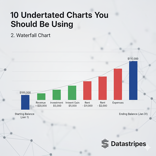 Ever needed to show how a starting value is affected by a series of positive and negative changes? The waterfall chart is your best friend. Perfect for financial statements, project budgeting, or illustrating step-by-step changes to a total.
A staple in finance and project management, the Waterfall Chart illustrates how an initial value is affected by a series of positive and negative changes. It’s the cleanest way to show the cumulative impact of different variables, such as calculating net income or illustrating budget changes step-by-step.
Ever needed to show how a starting value is affected by a series of positive and negative changes? The waterfall chart is your best friend. Perfect for financial statements, project budgeting, or illustrating step-by-step changes to a total.
A staple in finance and project management, the Waterfall Chart illustrates how an initial value is affected by a series of positive and negative changes. It’s the cleanest way to show the cumulative impact of different variables, such as calculating net income or illustrating budget changes step-by-step.
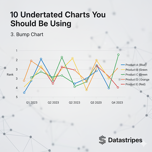
3. Bump Chart
When you want to visualize changes in rank over time or across different categories, a bump chart shines. It's an excellent alternative to stacked line charts, which can sometimes be messy. See how items move up or down in importance at a glance.
When your goal is to track changes in rank or position over time (or across different categories), the Bump Chart shines. Unlike stacked line charts, which can sometimes mislead, the Bump Chart focuses purely on the upward or downward trajectory of an item (e.g., product sales rankings), making the narrative of rank change immediately visible.
4. Raincloud Plot
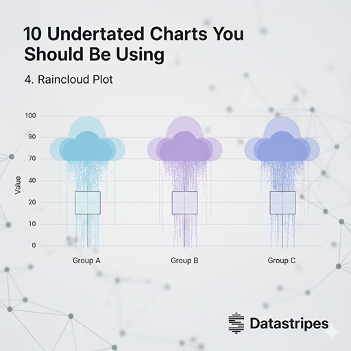 Combining the best of violin plots, box plots, and jittered points, the raincloud plot gives you a comprehensive view of data distribution. You get density, median/quartiles, and individual data points all in one elegant visual.
The Raincloud Plot is an elegant and comprehensive composite visualization. It integrates a Violin Plot (for density), a Box Plot (for quartiles and median), and the raw data points (often jittered) into one cohesive unit. It offers the most complete view of a variable's distribution in a single, concise chart.
Combining the best of violin plots, box plots, and jittered points, the raincloud plot gives you a comprehensive view of data distribution. You get density, median/quartiles, and individual data points all in one elegant visual.
The Raincloud Plot is an elegant and comprehensive composite visualization. It integrates a Violin Plot (for density), a Box Plot (for quartiles and median), and the raw data points (often jittered) into one cohesive unit. It offers the most complete view of a variable's distribution in a single, concise chart.
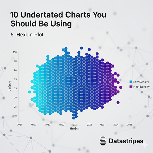
5. Hexbin Plot
When dealing with massive scatter plots where overplotting makes individual points indistinguishable, hexbin plots come to the rescue. They aggregate data into hexagonal bins, with the color intensity of each hex indicating the density of points within that area. Great for geographical data or large numerical datasets.
For extremely dense scatter plots, the Hexbin Plot aggregates data points into hexagonal bins. The colour intensity of each hexagon (or "bin") indicates the density of points within that area. It's perfect for large numerical or geographical datasets, effectively solving the problem of overplotting and revealing underlying "hot zones."
6. Contour Plot
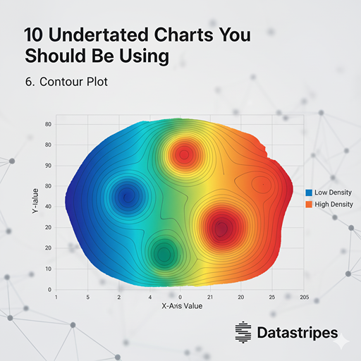 Similar to topographical maps, contour plots display three-dimensional relationships on a two-dimensional plane. They're perfect for showing continuous data density across two variables, revealing peaks, valleys, and gradients that might be missed otherwise.
Similar to the level curves on a topographical map, a Contour Plot displays a third variable (the "Z") on a two-dimensional plane (X and Y). Lines connect points of equal value, creating a map of continuous densities or values. It is excellent for analysing response surfaces or data gradients in fields like meteorology or physics simulations.
Similar to topographical maps, contour plots display three-dimensional relationships on a two-dimensional plane. They're perfect for showing continuous data density across two variables, revealing peaks, valleys, and gradients that might be missed otherwise.
Similar to the level curves on a topographical map, a Contour Plot displays a third variable (the "Z") on a two-dimensional plane (X and Y). Lines connect points of equal value, creating a map of continuous densities or values. It is excellent for analysing response surfaces or data gradients in fields like meteorology or physics simulations.
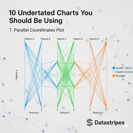
7. Parallel Coordinates Plot
For visualizing multi-dimensional data and finding clusters or patterns across many variables, parallel coordinates plots are incredibly effective. Each variable gets its own axis, and individual data points are drawn as lines connecting their values across these axes.
This chart is an essential tool for multi-dimensional analysis. Each variable gets its own vertical axis, and every observation is drawn as a line connecting its values across all axes. It allows you to quickly identify clusters, patterns, and correlations across many variables simultaneously.
8. Sunburst Chart
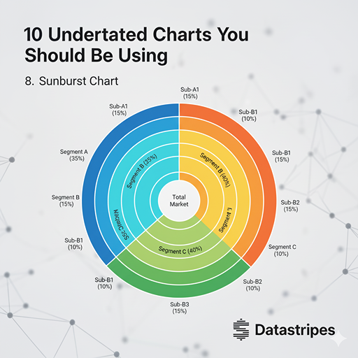 A sunburst chart is excellent for visualizing hierarchical data, much like a treemap, but with a radial layout. Each ring represents a level in the hierarchy, and the size of the arc shows the proportion of that category within its parent. Great for exploring market segments, file structures, or organizational charts.
Ideal for hierarchical data, the Sunburst Chart uses a radial layout. The central ring represents the top level, and each outer ring represents the next level of the hierarchy. The size of each segment’s arc shows its proportion within its parent, making it intuitive for exploring organizational structures or nested categories.
A sunburst chart is excellent for visualizing hierarchical data, much like a treemap, but with a radial layout. Each ring represents a level in the hierarchy, and the size of the arc shows the proportion of that category within its parent. Great for exploring market segments, file structures, or organizational charts.
Ideal for hierarchical data, the Sunburst Chart uses a radial layout. The central ring represents the top level, and each outer ring represents the next level of the hierarchy. The size of each segment’s arc shows its proportion within its parent, making it intuitive for exploring organizational structures or nested categories.
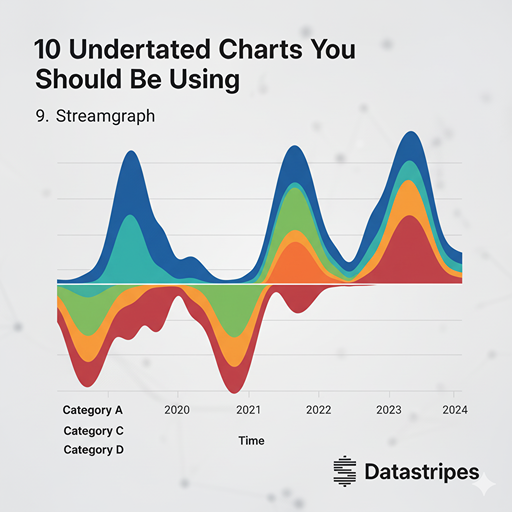
9. Streamgraph
A streamgraph is a type of stacked area graph that's offset around a central axis, creating a flowing, organic shape. It's superb for showing changes in quantity over time for different categories, emphasizing the magnitude and evolution of each category relative to the whole.
A dynamic variation of the stacked area chart, the Streamgraph is offset around a central axis, creating an organic, "flowing" shape. It’s superb for showing how the magnitude and composition of different categories change over time, emphasizing the overall flow and volume of the data.
10. Sankey Diagram
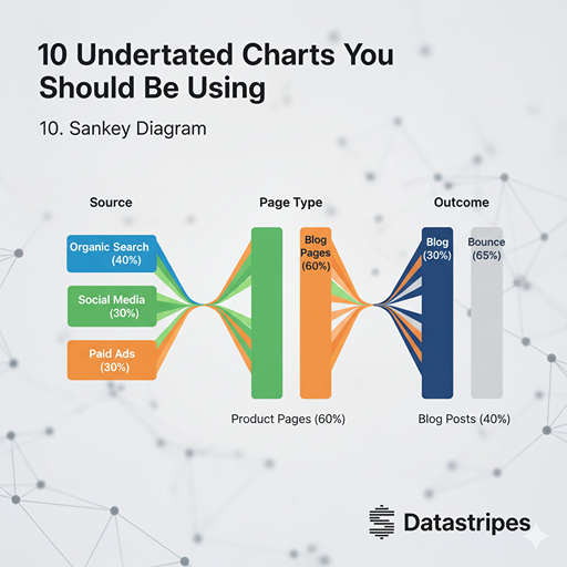 Sankey diagrams are powerful for visualizing the flow of quantities between different entities or stages. They clearly show how values split, merge, and transform, making them ideal for energy flow, financial transfers, or user journeys.
The Sankey Diagram is the king of flow visualization. It uses proportionally sized arrows to show how a quantity moves or transforms between different stages or entities. It is indispensable for mapping user journeys, energy flows, or financial resource allocation, clearly highlighting where major splits, merges, or losses occur.
Sankey diagrams are powerful for visualizing the flow of quantities between different entities or stages. They clearly show how values split, merge, and transform, making them ideal for energy flow, financial transfers, or user journeys.
The Sankey Diagram is the king of flow visualization. It uses proportionally sized arrows to show how a quantity moves or transforms between different stages or entities. It is indispensable for mapping user journeys, energy flows, or financial resource allocation, clearly highlighting where major splits, merges, or losses occur.
So?
Unlock Your Data's Full Potential with Datastripes
You now have a powerful arsenal of ten charts that can transform your data from simple numbers into compelling, insightful stories. While the power of these charts is undeniable, the challenge often lies in their creation. Many standard BI tools make producing anything beyond a basic bar or line chart a tedious, code-heavy process.
This is where Datastripes steps in.
Datastripes is designed to eliminate the complexity of advanced visualization. It offers an intuitive platform where all ten of these underrated charts, from the analytical Parallel Coordinates Plot to the visual Streamgraph—are pre-configured and ready to use. You don't need to write a single line of code or wrestle with custom settings. Simply upload your data, select the chart, and Datastripes automatically handles the layout and rendering.
Stop settling for basic charts that only tell half the story. If you're serious about extracting deep, actionable insights and presenting your findings with maximum impact, it's time to move beyond the bar chart.
Use Datastripes to effortlessly create these 10 powerful visualizations and start unlocking the full potential of your data today.