Free Online JSON Viewer: Turn Raw .json Files Into Insights
Houston, we have a problem: .json readability
So, you've got a JSON file in your hands. Maybe it's a log file from your server, a data dump from your database, or an export from an API. You open it up, and what do you see? nested objects and brackets that are impossible to read. That's right. Instead of a clear, structured view of your data, you're staring at a wall of text that's impossible to parse. Whether it's nested objects in JSON, misaligned columns in CSV, or verbose tags in XML, the raw format is designed for machines, not humans.
The Cognitive Challenge of Raw .json Files
When you open a JSON file, you're not just looking at data—you're looking at a format designed for machines, not humans. The raw structure creates several cognitive challenges. Starting from the stream of text, that data is buried under layers of syntax and formatting that your brain has to decode before it can even begin to understand the content. Or what about syntactic noise? The brackets, commas, quotes, and tags that define the structure of the file are like visual static that clutters the actual data. Your attention is split between parsing the syntax and trying to understand the content, which makes it much harder to see patterns or relationships. And then there's the issue of context. When you're looking at raw text, you see individual values but not distributions. You can't easily see relationships between fields, time series trends, or comparative analysis without manually aggregating data. All of this leads to cognitive overload. Large files can overwhelm your ability to comprehend the dataset, and trying to find trends or outliers is like searching for needles in haystacks. Decision-making based on raw text requires error-prone mental math, and communicating findings to others requires recreating insights manually.
The Hidden Costs of Raw .json Review
When you rely on raw text review for your data files, the costs go beyond just time. The inefficiency leads to analysis paralysis, where teams receive data but can't act on it quickly because understanding requires too much effort. Decision-making gets delayed while waiting for "someone technical" to analyze the file, and important insights get missed because nobody wants to spend hours parsing text. This ultimately undermines a data-driven culture when accessing data insights is prohibitively difficult. Additionally, there's a heavy tool dependency. You need Python/R scripts, Excel macros, or database imports just to see basic summaries. Each tool has different syntax, requiring specialized knowledge, and scripts can break when file formats change slightly. Collaboration becomes difficult when everyone needs to have identical toolchains. Finally, there's the risk of error propagation. Manual data interpretation leads to mistakes and misunderstandings, incorrect conclusions based on partial views (like only looking at the first 100 rows), sampling bias when you can't see the full distribution, and lost details when aggregating data manually.
The Traditional Approaches to JSON Visualization
When faced with a raw .json file, most people turn to one of the following solutions.
The first option is to use text editors like Notepad++, Sublime, or VS Code. While these tools can display raw file contents with syntax highlighting and support search and replace, they still just show you text. There's no aggregation, visualization, or analysis capabilities, and you're essentially reading code rather than understanding data. They also lack filtering, grouping, or statistical summaries, and are completely unusable for non-technical stakeholders.
The second option is to import the file into Excel or Google Sheets. These tools can import JSON files into a spreadsheet grid and provide formulas for calculations, as well as support basic charts. However, they struggle with hierarchical trees—if your file has nested structures, Excel often crashes or formats incorrectly. The import process can be painful, with text-to-columns wizards, delimiter detection failures, and encoding issues. Large files (100K+ rows) cause performance problems or won't load at all, and you need to manually create charts for every question. Additionally, they allow destructive editing where one wrong click can overwrite data, and they don't preserve the original file structure.
Someone might also write Python or R scripts to parse the file programmatically, perform complex analysis, and generate custom visualizations. However, this requires programming expertise that most teams don't have, and it can take 30-60 minutes to write a script for one-off analysis. Scripts can break when file structure changes, and they're not shareable with non-technical colleagues. There's also a maintenance burden for simple data viewing.
Finally, some might import the data into a database like PostgreSQL or MySQL. This allows you to store data in structured tables, enable SQL queries, and support large datasets. However, it requires database setup and maintenance, schema definition before import, SQL knowledge for analysis, and infrastructure overhead for simple data viewing. It also doesn't allow you to quickly explore one-off files.
Our Promise: 30 seconds from file to insight
With Datastripes, you can go from a raw .json file to actionable insights in just 30 seconds. Here's how it works:
Step 1: Drag & Drop Upload (5 seconds)
Open Datastripes in your browser (no installation, no signup required for basic use) and drag your .json file directly into the window. It works with files from your computer, cloud storage, or direct download, and supports files from kilobytes to gigabytes.
Step 2: Automatic Parsing (10 seconds)
Datastripes intelligently analyzes your JSON structure and flatten nested arrays automatically automatically. It detects data types (numbers, dates, categories, text), handles encoding issues (UTF-8, Latin-1, etc.) transparently, and preserves all data—nothing gets lost or corrupted.
Step 3: Interactive Exploration (15 seconds)
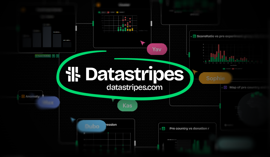
You get an instant table view where you can see your data in a clean, sortable grid. With one-click charts, you can click any column header to see the distribution. You can filter and segment by clicking values to filter or using search to find records. You can also switch views between table, chart, and raw views.
In total, you can go from file to actionable insights in just 30 seconds with Datastripes.
Just drag your .json file into the demo above to see how it works.
We master the art of turning raw data files into visual insights. No more staring at text. Start seeing patterns, trends, and outliers instantly. No installation. No coding. No hassle. Just drag, drop, and discover what your data is telling you.
Practical Examples: JSON Files in the Real World
Example 1: API Response Analysis
Scenario: You called a REST API and got a .json response with 500 records. You need to verify the data quality.
Traditional Approach:
- Open in text editor → scroll through thousands of lines of hierarchical trees
- Try to mentally check if all fields are present
- Sample a few records manually
- Maybe write a script to validate
- Time: 30-45 minutes
Datastripes Approach:
- Drag .json file into browser
- Automatically see: 500 records, 12 fields, data types detected
- Click each column to see value distribution
- Filter to see records with missing fields
- Spot outliers visually
- Time: 2 minutes
Example 2: Log File Investigation
Scenario: Production error occurred. You have log file with 10,000 entries. Need to find pattern.
Traditional Approach:
- Open in text editor
- grep for error codes
- Try to understand timing
- Manually reconstruct sequence
- Time: 1-2 hours
Datastripes Approach:
- Upload log file
- Datastripes flatten nested arrays automatically
- Create timeline chart of events
- Filter to error events
- See which components failed in sequence
- Time: 10 minutes
Example 3: Client Data Delivery
Scenario: Client sends monthly report as .json. You need to present insights to management.
Traditional Approach:
- Import to Excel
- Clean formatting issues
- Create pivot tables
- Build charts manually
- Copy to PowerPoint
- Time: 1-2 hours
Datastripes Approach:
- Drop file into Datastripes
- Instantly see key metrics
- One-click charts for trends
- Share live dashboard link
- Time: 5 minutes
Stop staring at hierarchical trees. Start seeing patterns, trends, and insights.
Visualize your JSON file now for free.
No installation. No coding. No hassle. Just drag, drop, and discover what your data is telling you.
Transform raw .json files from obstacles into insights in under a minute.