Data Flow Mapping: The Practical Guide to Visualizing Your Data (No-Code) in 2026
Understanding how your data moves is critical. Discover what Data Flow Mapping is and how you can create live, interactive data maps without using static diagramming tools.
Introduction
Where does our data come from? How is it transformed? Where does it end up? If these questions sound familiar, you need Data Flow Mapping. It's the process of visualizing the journey your data takes from its source to its final destination.
Many teams rely on static diagrams created with tools like Visio or Lucidchart. The problem? They become outdated almost instantly. But what if the map of your data flow was the data flow itself?
In this guide, we'll show you a revolutionary approach to Data Flow Mapping—one that is always live, always accurate, and that you can build without drawing a single box.
What is Data Flow Mapping?
A Data Flow Map (or Data Flow Diagram) is a visual representation of how information moves through a system. It shows:
- Inputs: The sources of the data (e.g., a database, a CSV file, an API).
- Processes: The transformations the data undergoes (e.g., filters, joins, calculations).
- Outputs: The final destination (e.g., a report, a dashboard, another database).
Its Business Benefits
- Transparency: Everyone on the team can understand the logic behind the data, not just the engineers.
- Simplified Debugging: If a report is wrong, you can trace the flow backward and find the error in seconds.
- Compliance & Security (GDPR): You need to know exactly where sensitive data is being processed.
- Fast Onboarding: A new colleague can understand an entire data pipeline in minutes.
Traditional vs. No-Code Data Flow Mapping
Most traditional Data Flow Mapping relies on manual diagramming tools. While these can be useful, they have significant drawbacks:
- Manual Updates: Every time the data process changes, someone has to update the diagram.
- Static Representation: They don't show real-time data or changes.
- Technical Barrier: Non-technical team members often struggle to understand complex diagrams.
Enter no-code data analytics platforms like Datastripes. These tools allow you to create data flows visually, using drag-and-drop interfaces. The best part? The visual representation is the actual data process.
We wrote a comprehensive guide on how to use Datastripes for no-code data analysis here; this article focuses specifically on how to leverage it for Data Flow Mapping.
But now, let's see how you can create a live Data Flow Map using Datastripes.
The Problem with Static Diagrams
Drawing a data flow is a good first step, but it's a manual task, separate from the actual process. The moment someone modifies a script or changes a filter, your beautiful diagram becomes a lie.
What if your analytics tool created the map as you worked?
This is where Datastripes changes the game. The node-based interface in Datastripes isn't just a way to work with data—it is a living, functional data flow map itself.
Building Your Data Flow Map in Datastripes
Instead of drawing, you build. Every action you take creates a piece of the map:
- Input Node: You start by dragging in your data source (e.g., a
users.csvfile). This is the start of your map. - Transformation Nodes: You add a "Filter" node to select only active users. Then, you add a "Join" node to enrich the data with another file,
purchases.csv. - Output Node: Finally, you connect the result to a "Bar Chart" node to visualize sales per user.
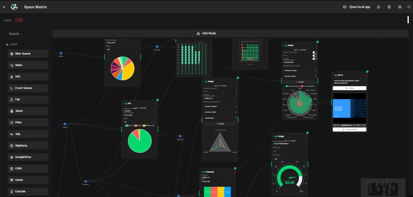
What you just built on the canvas is not a drawing. It’s a real, working, and repeatable process. If you change the filter, the map and the final result update instantly. Your documentation is always in sync with reality.
Conclusion: Stop Drawing, Start Building
Data Flow Mapping doesn't have to be a tedious, manual task destined to become obsolete. With a no-code, visual approach, your data flow map becomes a living tool that helps you make better decisions and work faster.
Want to build your first interactive data map? Drag your files into Datastripes and watch your flow come to life.