
Introducing the Cell Bar Chart: A New Lens for Dense Data
When analyzing relationships between two continuous variables, data scientists instinctively reach for the scatter plot. It's intuitive, straightforward, and effective—until your dataset grows large enough that thousands of overlapping points transform your visualization into an unreadable blob.
This phenomenon, known as overplotting, is one of the most persistent challenges in bivariate data visualization. The question becomes: how do we visualize both the individual data points and their collective density without sacrificing one for the other?
The Traditional Trade-offs
Most existing solutions force you to choose:
- Alpha transparency helps but quickly becomes ineffective with tens of thousands of points
- 2D histograms and heatmaps show density well but completely hide individual observations
- Hexbin plots quantize your data into hexagonal bins, losing the continuous nature of your variables
- Marginal histograms split density information into separate panels, forcing viewers to mentally integrate the information
Each approach makes a compromise. But what if we didn't have to?
Enter the Cell Bar Chart
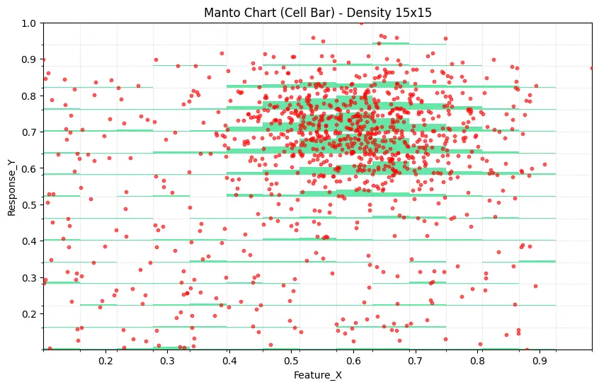
During the development of Datastripes, we created a hybrid visualization that we call the Cell Bar Chart (also known as the Manto Chart, coming from the creator). The core innovation is deceptively simple: overlay a vertical bar chart directly onto your scatter plot, where bar height represents the local density of data points.
The result is a single, integrated view where you can simultaneously:
- See individual data points and outliers
- Understand where your data concentrates
- Quantify the statistical weight of different regions
- Maintain the full resolution of your bivariate relationship
How It Works: The Technical Foundation
The Cell Bar Chart combines two layers:
Layer 1: The Scatter Foundation
Your raw data points are plotted as a traditional scatter plot. Nothing fancy here—just X versus Y, preserving every observation.
Layer 2: The Density Signal
Here's where it gets interesting. The X-axis is divided into discrete intervals (cells). For each cell, we:
- Count how many data points fall within that X-interval
- Calculate the relative frequency compared to the densest cell
- Map this frequency to a vertical bar height on the Y-axis
- Render semi-transparent bars that reveal the density distribution
The key insight is using the Y-axis dimension to encode frequency information while still plotting Y-values. The transparency ensures you can see both the underlying points and the density overlay.
When Cell Bar Charts Shine
This visualization pattern excels in specific analytical scenarios:
Identifying High-Confidence Regions
When you see a strong trend in your scatter plot, the Cell Bar immediately tells you whether that trend is supported by 10 points or 10,000 points. The height of the density bars provides instant visual confidence intervals.
Segmented Analysis
If your analysis involves binning or bucketing the independent variable (common in decision trees, customer segmentation, or time-series analysis), Cell Bar Charts highlight which segments carry the most statistical weight.
Revealing Hidden Patterns
Sometimes what looks like a uniform distribution in a scatter plot is actually highly concentrated in specific X-ranges. The density bars make these patterns immediately obvious.
Quality Control
In manufacturing or process control data, Cell Bar Charts can quickly show whether anomalies occur in data-rich regions (potentially meaningful) or data-sparse regions (potentially artifacts).
Building Your Own: A Python Implementation
Here's a practical implementation using standard Python libraries:
import pandas as pd
import numpy as np
import matplotlib.pyplot as plt
import matplotlib.patches as patches

def create_cellbar_chart(df, x_col, y_col, n_cells=15,
                         max_points=2000, bar_alpha=0.6):
    """
    Generate a Cell Bar Chart combining scatter and density visualization.

    Parameters:
    -----------
    df : DataFrame
        Input data
    x_col : str
        Column name for X-axis
    y_col : str
        Column name for Y-axis
    n_cells : int
        Number of cells (bins) along X-axis
    max_points : int
        Maximum scatter points to display (for performance)
    bar_alpha : float
        Transparency of density bars (0-1)
    """

    # Clean and prepare data
    data = df[[x_col, y_col]].apply(pd.to_numeric, errors='coerce').dropna()

    if data.empty:
        raise ValueError("No valid data after cleaning")

    # Calculate data bounds
    x_min, x_max = data[x_col].min(), data[x_col].max()
    y_min, y_max = data[y_col].min(), data[y_col].max()

    # Create bins
    x_bins = np.linspace(x_min, x_max, n_cells + 1)
    y_bins = np.linspace(y_min, y_max, n_cells + 1)

    # Assign each point to a 2D bin
    data['x_bin'] = pd.cut(data[x_col], bins=x_bins,
                           include_lowest=True, labels=False)
    data['y_bin'] = pd.cut(data[y_col], bins=y_bins,
                           include_lowest=True, labels=False)

    # Calculate density
    density = data.groupby(['x_bin', 'y_bin']).size().reset_index(name='count')
    max_density = density['count'].max()

    # Cell dimensions
    cell_width = (x_max - x_min) / n_cells
    cell_height = (y_max - y_min) / n_cells

    # Sample data for scatter if needed
    scatter_data = data.sample(n=min(len(data), max_points), random_state=42)

    # Create plot
    fig, ax = plt.subplots(figsize=(12, 7))

    # Draw density bars
    for _, row in density.iterrows():
        x_idx = row['x_bin']
        y_idx = row['y_bin']
        count = row['count']

        # Calculate bar height (90% of cell height max)
        bar_height = (count / max_density) * cell_height * 0.9

        # Position rectangle from bottom of cell
        x_pos = x_min + x_idx * cell_width
        y_pos = y_min + y_idx * cell_height

        # Draw density rectangle
        rect = patches.Rectangle(
            (x_pos, y_pos),
            cell_width,
            bar_height,
            linewidth=0,
            facecolor='#00d86f',
            alpha=bar_alpha,
            zorder=1
        )
        ax.add_patch(rect)

    # Overlay scatter plot
    ax.scatter(scatter_data[x_col], scatter_data[y_col],
              color='#ff4444', s=15, alpha=0.7,
              label=f'Data Points (n={len(scatter_data):,})',
              zorder=5)

    # Styling
    ax.set_xlim(x_min, x_max)
    ax.set_ylim(y_min, y_max)
    ax.grid(True, alpha=0.3, linestyle='--')
    ax.set_xlabel(x_col, fontsize=12)
    ax.set_ylabel(y_col, fontsize=12)
    ax.set_title(f'Cell Bar Chart: {x_col} vs {y_col}',
                fontsize=14, fontweight='bold')
    ax.legend(loc='upper right')

    return fig, ax

# Example: Generate synthetic data with clustering
np.random.seed(42)

# Create a dense cluster
cluster_x = np.random.normal(0.5, 0.08, 800)
cluster_y = np.random.normal(0.6, 0.08, 800)

# Add sparse background data
background_x = np.random.uniform(0, 1, 400)
background_y = np.random.uniform(0, 1, 400)

# Combine datasets
x_data = np.concatenate([cluster_x, background_x])
y_data = np.concatenate([cluster_y, background_y])

# Clip to valid range
x_data = np.clip(x_data, 0, 1)
y_data = np.clip(y_data, 0, 1)

# Create DataFrame
df = pd.DataFrame({
    'Variable_X': x_data,
    'Variable_Y': y_data
})

# Generate visualization
fig, ax = create_cellbar_chart(df, 'Variable_X', 'Variable_Y', n_cells=20)
plt.tight_layout()
plt.show()
This implementation creates a clean, production-ready Cell Bar Chart that you can adapt to your specific data and styling needs.
Design Considerations
When implementing Cell Bar Charts in your workflow, keep these principles in mind:
Cell Count: Too few cells and you lose density resolution; too many and the visualization becomes noisy. Start with 15-20 cells and adjust based on your data distribution.
Color Choice: Use contrasting colors for scatter points and density bars. Ensure the density bars have sufficient transparency (0.5-0.7 alpha) to see underlying points.
Sample Size: For datasets exceeding 5,000 points, consider sampling the scatter layer while keeping the full dataset for density calculation. This maintains performance without losing analytical value.
Grid Alignment: Adding subtle grid lines aligned with cell boundaries helps viewers understand the binning structure.
Limitations and Future Directions
Like any visualization technique, Cell Bar Charts have constraints:
- They work best with continuous data on both axes
- Very sparse datasets may not benefit from the density overlay
- The binning introduces a degree of discretization that may not suit all analyses
Potential enhancements could include:
- Adaptive cell sizing based on local data density
- Interactive hover tooltips showing exact counts per cell
- Color-coded density bars to show multiple data categories
- 3D extensions for trivariate analysis
Why This Matters
Data visualization is ultimately about reducing cognitive load. The Cell Bar Chart does this by collapsing two pieces of information—individual observations and their density—into a single, coherent visual frame.
In an era where datasets routinely contain millions of rows, tools that help us see both the forest and the trees become increasingly valuable. The Cell Bar Chart represents a small but meaningful step toward more information-dense, yet still interpretable, data visualization.
Try It Yourself
The complete implementation, including interactive examples and sample datasets, is available for the data science community to experiment with and extend. Whether you're exploring customer behavior, analyzing experimental results, or hunting for outliers in sensor data, the Cell Bar Chart offers a new perspective on the relationships hiding in your data.
Have you encountered overplotting challenges in your work? How do you currently handle dense bivariate data? Share your experiences and alternative approaches in the comments.