How to build dashboards without Datawrapper: Data storytelling reimagined (2026)
If you work in media, communications, or content creation, you have likely encountered Datawrapper. It is the go-to tool for journalists and bloggers who need to turn a spreadsheet into a clean, responsive chart or map in seconds. It excels at simplicity and presentation.
But what happens when your data isn't "chart-ready"? What if you need to combine files, clean up messy columns, or build a comprehensive dashboard rather than a single standalone chart?
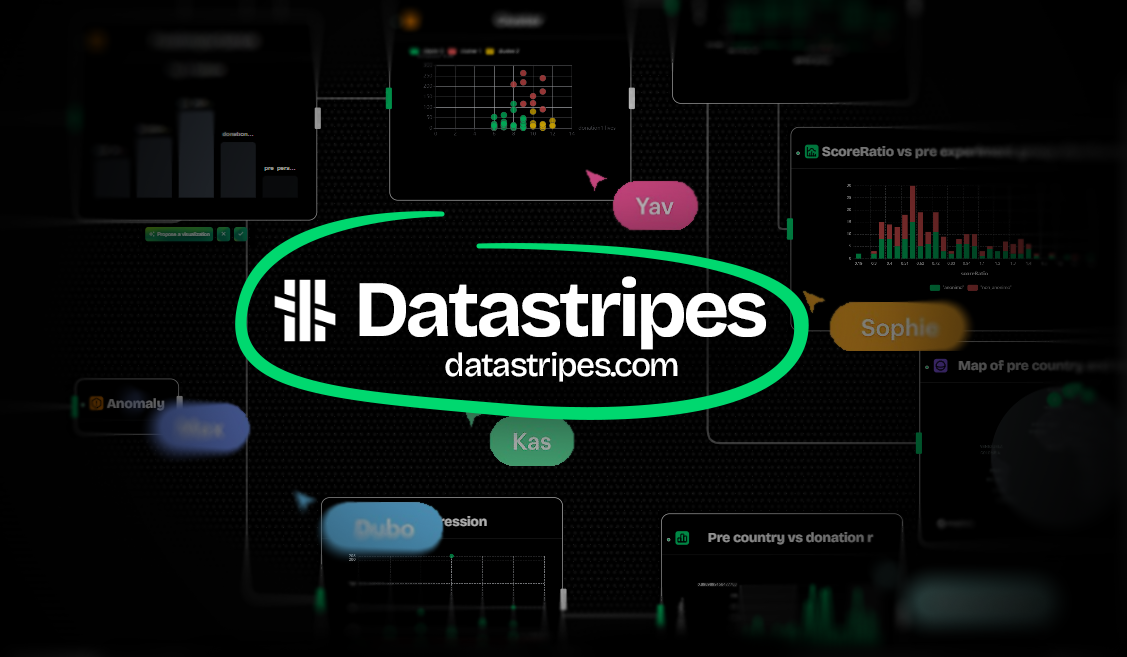
Enter Datastripes. While Datawrapper focuses on the final output, Datastripes manages the entire data journey. It combines the ease of no-code visualization with the power of a data transformation engine.
Let’s explore the key differences to help you decide which platform fits your workflow.
The Workflow: Ready-made data vs. The Data Pipeline
Datawrapper is designed with a specific assumption: you already have clean, formatted data. The workflow usually involves pasting a clean CSV, checking column types, and jumping straight to visualization. If your data needs heavy filtering, merging, or cleaning, you usually have to do that in Excel before you upload it.
Datastripes takes a different approach with its Visual Data Pipeline. It understands that data is rarely perfect. You can upload raw files, and then use a visual flowchart interface to clean, merge, filter, and transform that data.
- Datawrapper: Best if your data is already perfect.
- Datastripes: Best if you need to clean, shape, or explore your data before charting.
Visualizing the Process: The "Black Box" vs. The Flowchart
When you use Datawrapper, the logic happens behind the scenes. You input data, and you get a chart. If something looks wrong, you often have to go back to your spreadsheet to find the error.
Datastripes visualizes the logic itself. Every step—from loading the file to filtering rows—is represented as a node in a visual flowchart. You can see exactly how data flows from A to B. This makes troubleshooting incredibly easy and allows teams to understand how a conclusion was reached, not just see the final result.
Dashboards vs. Single Charts
Datawrapper is king of the "embedded chart." It is optimized for creating single, lightweight graphics to embed in news articles or blog posts. While you can group charts, it isn't designed as a Business Intelligence (BI) dashboarding tool.
Datastripes offers full Dashboard capabilities. You can arrange multiple charts, metrics, and text elements on a canvas that interacts with your data pipeline. This makes it suitable for business reports, project status overviews, and client presentations where context is just as important as the chart itself.
Chart Variety: Essentials vs. Exploration
Datawrapper offers a highly curated selection of charts (about 20 types) that follow best practices for journalism—bar charts, line charts, scatter plots, and excellent symbol maps. They look professional by default and are hard to "break."
Datastripes provides over 100 chart types. While it covers the essentials, it also opens the door to advanced exploratory visualizations like Sankey diagrams, Beeswarm plots, Violin plots, and complex geospatial layers. If you are doing exploratory data analysis (EDA) to find hidden patterns, the sheer variety in Datastripes gives you more angles to look at your data.
Data Transformation capabilities
This is the biggest technical differentiator.
- Datawrapper: limited to basic transposition and column type detection.
- Datastripes: offers a no-code ETL (Extract, Transform, Load) environment based on drag and drop nodes and flows. You can perform joins (merging two datasets), aggregations (group by), calculations, and text parsing without writing a single line of code.
If you are just visualizing a list of "Top 10 Countries by GDP," Datawrapper is perfect. If you need to calculate that GDP growth from three different raw files first, Datastripes is the answer.
AI Assistance
Datastripes integrates a GPT-powered AI assistant directly into the workspace. It can help you understand errors, suggest transformations, and even summarize your data insights in plain English.
Datawrapper is currently more focused on traditional UI controls and does not offer a conversational AI assistant to help build your analysis.
Reporting: Embeds vs. PowerPoint
Both tools allow you to export images (PNG/SVG/PDF).
Datawrapper shines in HTML embedding. Its charts are responsive and look perfect on mobile devices, which is why newsrooms love it.
Datastripes shines in Business Reporting. It features a native PowerPoint (PPTX) export. You can turn your analysis into a slide deck with editable native charts in one click. If your primary audience is in the boardroom rather than on a news website, this feature is a massive time-saver.
Pricing Models
Datawrapper has a free tier that is generous but requires attribution. Its paid tiers (Custom/Enterprise) are geared towards media organizations and can become expensive for small businesses or individuals who need private charts without watermarks.
Datastripes offers a transparent pricing model designed for individuals and teams, with a focus on affordability and feature access (like connectors and exports) rather than just view counts.
Summary Comparison
| Feature | Datastripes | Datawrapper |
|---|---|---|
| Primary Use Case | End-to-end Analysis & BI | News & Journalism |
| Data Cleaning | ✅ Visual ETL Pipeline | ❌ Basic checks only |
| Input Data | Raw / Messy | Must be Clean / Formatted |
| Visual Interface | Flowchart (Node-based) | Step-by-step Wizard |
| Chart Types | 100+ (Exploratory) | ~20 (Standard/Polished) |
| Dashboards | ✅ Interactive Dashboards | ⚠️ Grouped charts only |
| AI Assistant | ✅ Integrated | ❌ |
| Export Focus | PowerPoint & Reports | Web Embeds & Mobile |
| Learning Curve | Low (No-code) | Very Low |
Which one should you choose?
Choose Datawrapper if:
- You are a journalist or content creator.
- You have a clean dataset ready to go.
- You need a specific chart to look perfect on a mobile article.
- You don't need to perform calculations or merge files.
Choose Datastripes if:
- You are an analyst, marketer, or business owner.
- Your data needs cleaning, merging, or preparation.
- You want to build a dashboard or export a presentation.
- You need to visually explore your data to find the story before you tell it.
Datastripes bridges the gap between complex BI tools and simple chart makers. It gives you the power to handle raw data without the complexity of coding, making it the ideal choice for modern data storytelling.