
How to Build an Interactive Dashboard in Under 5 Minutes (No Code Required)
Tired of static spreadsheets and complex BI tools? You have valuable data, but turning it into actionable insights feels like a full-time job. Traditional tools like Power BI or Tableau are powerful, but they come with a steep learning curve and can take hours to configure.
What if you could build a fully interactive, beautiful dashboard directly in your browser in the time it takes to drink a coffee?
With Datastripes, you can. Our no-code, drag-and-drop interface is designed for speed and clarity. This guide will show you how to go from a raw CSV file to a shareable dashboard in less than five minutes.
The 5-Minute Dashboard Challenge: What You'll Need
All you need to get started is:
- A dataset. For this example, we'll use a sample sales dataset (you can download one or use your own).
- A web browser. That's it. No installs, no servers, no setup.
Our goal: Create a dashboard that visualizes sales performance, showing revenue by region and product category.
Step 1: Upload Your Data (30 Seconds)
First, navigate to the Datastripes canvas. You can either drag your CSV file directly onto the page or click to upload it.
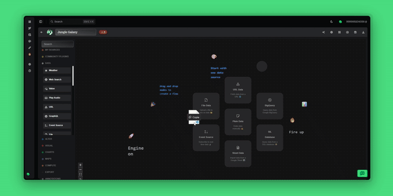
Datastripes instantly parses your data, displaying it in a table. All processing happens locally in your browser, so your data remains 100% private and secure.
Step 2: Create Your First Chart - Revenue by Region (90 Seconds)
Let's visualize where your sales are coming from.
- Drag in a Chart Node: From the nodes library on the left, grab a 'Chart' node and drop it onto the canvas.
- Connect Your Data: Drag a line (a "stripe") from your data node to the chart node. The chart instantly populates.
- Configure the Chart:
- Select 'Bar Chart' as the chart type.
- Set the X-Axis to your 'Region' or 'City' column.
- Set the Y-Axis to your 'Sales' or 'Revenue' column.
- Use the 'Sum' aggregation to total the sales for each region.
Just like that, you have a clear view of your top-performing regions, whether you're analyzing sales data for London's boroughs or tracking marketing KPIs across New York City.
Step 3: Add a Second Chart - Sales by Product Category (90 Seconds)
Now, let's see which products are selling best.
- Drag in Another Chart Node: Add a second chart node to the canvas.
- Connect the Same Data: You can connect your original dataset to multiple charts.
- Configure the Chart:
- This time, select a 'Pie Chart' or 'Donut Chart'.
- Set the 'Labels' to your 'Product Category' column.
- Set the 'Values' to your 'Sales' column.
You now have an immediate, easy-to-understand breakdown of your product performance.
Step 4: Assemble Your Interactive Dashboard (30 Seconds)
This is where the magic happens.
- Drag in a 'Dashboard' Node: Find it in the output nodes library.
- Connect Your Charts: Drag stripes from both of your chart nodes to the dashboard node.
- View Your Dashboard: Click the dashboard node to see your charts presented in a clean, professional layout.
The dashboard is fully interactive. Clicking on a region in your bar chart can filter the product category chart, and vice-versa. You’ve just built a powerful BI tool without writing a single line of code.
Why This is a Game-Changer
In under five minutes, you've accomplished what can take hours in other tools:
- Zero Setup: It all works in your browser.
- Total Privacy: Your data never left your computer.
- Instant Visualization: See the impact of your changes in real-time.
- Easy Sharing: Export your dashboard to a PowerPoint slide or share a link.
Datastripes empowers everyone—from marketers in Manchester to financial analysts in Frankfurt—to make data-driven decisions quickly and confidently.
Ready to take the challenge?
🔥 Try Datastripes for Free and Build Your First Dashboard Now