How to create a Radar Chart without coding
You need to visualize multivariate data, and you know a Radar Chart is the perfect chart for the job.
But when you try to make one in traditional tools like Excel, you realize it is cumbersome and requires manual data arrangement. You waste hours looking for tutorials or templates, only to end up with a static image that you can't interact with.
You need a better way.
The Problem with Traditional Tools
Most BI tools treat the Radar Chart as an "advanced" feature—something reserved for data scientists or users who can write code. This creates unnecessary barriers for analysts who simply want to create effective visualizations.
Why Excel Falls Short for Radar Chart
When you try to create a Radar Chart in Excel, you encounter multiple roadblocks:
- Complex Data Formatting: You need to restructure your data into a very specific format that Excel expects. This often means creating helper columns, pivot tables, and manual calculations that can take hours to set up correctly.
- Limited or No Native Support: Excel either doesn't support Radar Charts at all, or provides such limited functionality that the result looks amateurish and lacks the visual impact you need.
- Manual Calculations Required: For many advanced chart types, you need to pre-calculate values, percentages, or coordinates manually before even attempting to create the visualization.
- Static Output Only: Even if you manage to create the chart, the final result is a static image embedded in your spreadsheet. No interactivity, no drill-downs, no dynamic filters—just a picture.
- Poor Customization: Adjusting colors, labels, sizes, and styling in Excel is cumbersome and often produces inconsistent results.
- Manual Update Hell: When your data changes, you have to manually update everything. There's no automated refresh, meaning you're constantly rebuilding charts.
- Performance Issues: Large datasets cause Excel to lag or crash entirely when attempting to render complex visualizations.
The Plugin Trap
Frustrated Excel users often turn to third-party plugins or add-ons, but these bring their own set of problems:
- Licensing Costs: Quality visualization plugins can cost hundreds or thousands of dollars per user per year
- Compatibility Nightmares: Plugins frequently break with Excel updates, don't work on Mac versions, or aren't available for Excel Online
- Security and IT Restrictions: Corporate IT departments routinely block plugin installations due to security policies
- Vendor Lock-in: Your visualizations become dependent on a specific tool that may be discontinued
- Steep Learning Curves: Each plugin has its own unique interface, terminology, and quirks that you need to learn
- Limited Support: Many plugins have poor documentation and slow customer support
The Coding Route
Desperate for better visualizations, some analysts turn to Python (with Matplotlib, Plotly, or Seaborn) or R (with ggplot2):
- Steep Technical Learning Curve: You need to learn programming syntax, data structures, library functions, and debugging techniques—skills that take months or years to develop
- Environment Setup Hell: Installing Python/R, managing virtual environments, dealing with package version conflicts, and troubleshooting installation errors
- Time Investment: What should take 5 minutes can turn into hours of Googling error messages and Stack Overflow threads
- Maintenance Burden: Code breaks when libraries update, requiring constant maintenance and refactoring
- Not Accessible to Stakeholders: Non-technical team members can't modify, update, or recreate your visualizations without you
- Context Switching: Moving between your analysis tool and a code editor disrupts your workflow and thinking process
Understanding the Radar Chart in Depth
A Radar Chart, also known as a spider chart or web chart, is a graphical method of displaying multivariate data in the form of a two-dimensional chart. Each variable is represented on axes starting from the same point, allowing for easy comparison of multiple variables across different categories.
When to Use a Radar Chart
A Radar Chart excels in specific analytical scenarios where other chart types fall short:
-
Multivariate data Analysis: This chart type is specifically designed to help you understand complex patterns, relationships, and distributions in this type of data that simpler charts like bar graphs or line charts simply cannot convey effectively.
-
Comparative Multi-Dimensional Analysis: When you need to compare multiple categories, time periods, or segments simultaneously and see how they relate to each other.
-
Pattern Recognition and Anomaly Detection: The visual nature of Radar Charts makes patterns, clusters, outliers, and anomalies immediately apparent to the human eye in ways that tables of numbers never can.
-
High-Impact Stakeholder Presentations: When you need a visually compelling, professional way to communicate complex insights to executives, clients, or board members who don't have time for detailed explanations.
Real-World Use Cases by Role
Here's how different professionals leverage Radar Charts in their daily work:
Business Analysts:
- Tracking and visualizing KPIs across multiple dimensions simultaneously
- Creating executive dashboards that tell a story at a glance
- Performing market segmentation analysis and customer clustering
- Analyzing competitive positioning and market share dynamics
- Presenting quarterly business reviews with visual impact
Data Scientists:
- Exploratory data analysis (EDA) to understand data structure before modeling
- Communicating complex model results to non-technical stakeholders
- Visualizing feature importance and model performance metrics
- Presenting A/B test and experimentation results
- Showing distributions and correlations that inform model selection
Product Managers:
- Mapping and optimizing user journeys through product features
- Tracking feature adoption rates across user segments
- Visualizing conversion funnels and identifying drop-off points
- Presenting sprint retrospectives and roadmap priorities
- Analyzing usage patterns to inform product decisions
Marketing Teams:
- Visualizing multi-channel campaign performance and attribution
- Analyzing customer acquisition funnels across different channels
- Presenting ROI and budget allocation recommendations
- Tracking customer segmentation and lifetime value
- Monitoring brand awareness and sentiment metrics
Financial Analysts:
- Visualizing revenue waterfalls and variance analysis
- Presenting budget vs. actuals with clear visual breakdowns
- Analyzing cost structures and profit margins
- Tracking financial KPIs across business units
- Communicating investment performance to stakeholders
Operations Managers:
- Visualizing supply chain flows and bottlenecks
- Analyzing resource utilization and capacity planning
- Tracking quality metrics and defect rates
- Presenting efficiency improvements and process optimizations
- Monitoring logistics and distribution networks
Create a Radar Chart in Datastripes: The Modern Approach
Datastripes makes advanced visualization accessible to everyone, regardless of technical skill level. We believe that powerful data visualization should be as easy as drag-and-drop, with professional results in minutes instead of hours.
The Simple, Intuitive Process
1. Upload Your Data
Just drag your CSV, Excel, JSON, or even copy-paste from Google Sheets directly into the browser. No account required for basic use, no data upload to our servers—everything processes locally in your browser for maximum privacy and security.
Datastripes automatically handles:
- Different file encodings (UTF-8, Latin-1, etc.)
- Various delimiters (commas, semicolons, tabs, pipes)
- Messy headers and inconsistent formatting
- Mixed data types within columns
- Date formats from around the world
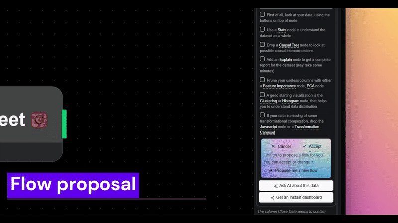
2. Intelligent Auto-Detection
Our smart engine analyzes your data structure and automatically:
- Identifies column types (numeric, categorical, temporal, geospatial)
- Detects relationships and correlations between variables
- Suggests the optimal columns for your Radar Chart based on data characteristics
- Handles missing values and data quality issues gracefully
- Recognizes common patterns and data structures
3. Select Your Chart Type
Choose Radar Chart from our curated library of 100+ professional visualization types. Each chart type in our library includes:
- A live preview showing exactly what it looks like with sample data
- Clear guidance on when it's most appropriate to use
- Visual explanation of what data structure it requires
- Examples of insights it can reveal
4. Smart Column Mapping
Datastripes automatically maps your columns to the appropriate chart dimensions (axes, categories, values, etc.). The system intelligently suggests the best mapping based on:
- Data types and ranges
- Cardinality (number of unique values)
- Statistical distributions
- Common visualization best practices
Don't like the automatic mapping? Simply drag and drop different columns to different chart elements. The preview updates instantly, so you can experiment freely.
5. Instant Live Preview
See your Radar Chart render in real-time as you make adjustments. No compile step, no waiting, no refresh button. Every change—whether you're switching columns, adjusting filters, or tweaking styling—reflects immediately in the preview.
6. Comprehensive Customization
Fine-tune every aspect of your visualization with our intuitive controls:
- Color Schemes: Choose from professionally designed color palettes, including color-blind friendly options, brand-specific themes, and custom colors
- Labels and Annotations: Add titles, axis labels, data labels, custom annotations, and explanatory text
- Scale and Range: Adjust axis scales (linear, logarithmic), set min/max ranges, enable auto-scaling
- Tooltips: Customize what information appears when users hover over data points
- Legends: Position, style, and configure legends for clarity
- Fonts and Typography: Control text sizes, families, weights, and styling
- Responsive Sizing: Set dimensions for different display contexts (desktop, mobile, presentation)
7. Interactive Exploration
Your Radar Chart isn't just a picture—it's a fully interactive data exploration tool:
- Hover for Details: Move your mouse over any element to see exact values, percentages, and related information
- Click to Filter: Click on legend items or data points to filter the view and focus on specific subsets
- Zoom and Pan: For large or detailed visualizations, zoom in on areas of interest and pan around
- Toggle Series: Show or hide different data series to reduce visual clutter and focus on what matters
- Dynamic Queries: Apply filters and transformations on the fly without recreating the chart
No plugins required. No coding needed. No complex data transformations. Just instant, professional-quality insights that you can explore interactively.
Advanced Features and Capabilities
Automated Updates and Refresh
Connect your data source (Google Sheets, database, API) and watch your Radar Chart update automatically when the underlying data changes. Perfect for:
- Live dashboards that always show current data
- Weekly/monthly reports that self-update
- Monitoring systems that refresh in real-time
- Presentations that pull fresh data at showtime
Multiple Data Sources Integration
Combine data from different files, databases, or APIs in a single visualization. Datastripes handles:
- Automatic joining and merging based on common keys
- Union operations to stack datasets
- Data type reconciliation
- Conflict resolution for overlapping data
Responsive and Adaptive Design
Your Radar Chart automatically adapts to different screen sizes and contexts:
- Desktop displays with full interactivity
- Mobile devices with touch-friendly controls
- Large presentation screens with enhanced visibility
- Print layouts with optimal resolution
- Embedded contexts (websites, blogs, internal tools)
Collaboration and Sharing
Share your work with colleagues, clients, or the public:
- Interactive Links: Recipients can explore, filter, and interact with the visualization
- Embed Codes: Place your chart on websites, Notion pages, internal wikis, or SharePoint
- Permission Controls: Set who can view, edit, or download
- Comments and Annotations: Collaborate with team members directly on the visualization
- Version History: Track changes and revert to previous versions if needed
Advanced Analytics Integration
Go beyond basic visualization with built-in analytics:
- Statistical Overlays: Add trend lines, confidence intervals, standard deviations
- Forecasting: Extend time series into the future with predictive models
- Clustering: Apply automatic clustering algorithms to identify groups
- Outlier Detection: Highlight anomalies and unusual patterns
- Correlation Analysis: See relationships between variables visually
Export Your Radar Chart Anywhere
Once your Radar Chart looks perfect, you have multiple professional export options that fit any workflow:
PowerPoint / Presentation Export
Export directly to an editable PowerPoint or Google Slides presentation. Unlike crude screenshot paste-jobs, this export includes:
- Fully editable chart elements (you can adjust colors, labels, etc. in PowerPoint)
- Linked data tables for reference and validation
- Preserved formatting and styling
- High resolution optimized for both screens and printing
- Notes and annotations carried over
Interactive Web Link
Share a live, interactive URL that allows viewers to:
- Explore the data by hovering, clicking, and filtering
- Apply their own custom filters and views
- Download the underlying data in their preferred format
- Export their own customized versions
- Access from any device without installing software
The link remains live and can be updated by you at any time, so stakeholders always see the latest version.
High-Quality Image Export
Download static images in multiple formats:
- PNG: Perfect for reports, documents, and presentations (with transparent backgrounds if needed)
- SVG: Vector format that scales infinitely without quality loss, ideal for printing and logos
- PDF: High-resolution output for professional reports and publications
Full control over dimensions, resolution (DPI), aspect ratio, and background colors.
Embed Code for Websites
Get a simple iframe snippet to embed your Radar Chart directly into:
- Company websites and marketing pages
- Internal documentation and wikis
- Notion, Confluence, or SharePoint pages
- Blog posts and articles
- Customer-facing dashboards
The embedded chart is fully interactive and updates automatically when you update the source.
Data Export with Transformations
Download the underlying data in the format you need:
- CSV: Universal format for spreadsheets and databases
- Excel: With multiple sheets, formatting, and formulas
- JSON: For developers and API integrations
- SQL: Generate INSERT statements for database loading
All transformations, filters, and calculations you applied are reflected in the exported data.
Why the Radar Chart Matters for Your Analysis
A Radar Chart, also known as a spider chart or web chart, is a graphical method of displaying multivariate data in the form of a two-dimensional chart. Each variable is represented on axes starting from the same point, allowing for easy comparison of multiple variables across different categories.
A Radar Chart is perfect for multivariate data because it reveals patterns, flows, and relationships that would be invisible or extremely difficult to detect in tables of numbers or simpler chart types.
The Cognitive Science Behind Visual Analysis
Research in cognitive psychology shows that humans process visual information 60,000 times faster than text. A well-designed Radar Chart leverages this by:
- Reducing Cognitive Load: Complex multi-dimensional relationships become immediately apparent without mental calculation
- Enabling Pattern Recognition: Your brain's powerful visual cortex automatically spots trends, clusters, and anomalies
- Supporting Better Decision Making: Visual clarity and immediate comprehension lead to faster, more confident decisions
- Improving Information Retention: People remember visual information significantly better than tables or text (studies show 65% retention vs. 10%)
- Facilitating Communication: A single clear visualization can replace pages of written explanation
Measurable Business Impact
Organizations that effectively leverage advanced data visualizations like Radar Charts report tangible benefits:
- 40% faster decision-making due to clearer, more actionable insights
- 30% reduction in meeting time when presenting data visually instead of with spreadsheets
- Better stakeholder buy-in through compelling visual storytelling that makes the case obvious
- Increased data literacy across teams as more people engage with data
- Reduced errors from misinterpretation of complex tables
- Higher analyst productivity by eliminating time spent on manual chart creation
Strategic Competitive Advantage
In today's data-driven business environment, the ability to quickly create and share insightful visualizations is a competitive differentiator. Organizations that can:
- Spot trends and opportunities faster than competitors
- Communicate insights more effectively to stakeholders
- Make data-driven decisions at all levels
- Democratize data access across the organization
...consistently outperform those stuck with spreadsheets and static reports.
Beyond Radar Chart: Your Complete Visualization Toolkit
The Radar Chart is just one of many advanced, professional-quality charts you can create effortlessly with Datastripes. Other sophisticated visualization types that are traditionally difficult to build in Excel include:
- Sankey Diagrams for visualizing flows, transfers, and journey mapping
- Beeswarm Plots for distribution analysis without overlapping points
- Treemaps for hierarchical data and proportional relationships
- Network Graphs for relationship mapping and connection visualization
- Parallel Coordinates for high-dimensional multivariate data
- Heatmaps for correlation matrices and density visualization
- Ridgeline Plots for comparing distributions across categories
- Chord Diagrams for inter-relationships between entities
- Sunburst Charts for hierarchical data with proportions
- Alluvial Diagrams for tracking changes over time
- Box Plots for statistical distributions and outlier detection
- Violin Plots combining box plots with density visualization
Each of these chart types serves specific analytical needs and provides unique insights that simpler visualizations miss.
Discover more of these underrated chart types and learn when to use each one in our comprehensive blog series on advanced visualizations.
Get Started: Create Your First Radar Chart Today
Stop struggling with complex custom scripts, expensive plugins, and coding just to create professional visualizations. You probably don't need any of that complexity.
That's exactly why we built Datastripes: to democratize data visualization and empower analysts, marketers, product managers, researchers, and business professionals to create stunning visualizations like the Radar Chart quickly, easily, and professionally.
No Barriers to Entry
- No account required to try it out and create basic visualizations
- No credit card needed for core features
- No software installation — runs entirely in your browser
- No data upload risks — your data stays on your device
- No coding skills — if you can drag and drop, you can create professional charts
Start in Under 30 Seconds
- Visit Datastripes
- Drag your data file into the browser
- Select Radar Chart from the chart library
- Customize and export
That's it. You'll go from raw data to presentation-ready visualization faster than Excel even opens.
Create your Radar Chart now and experience how easy advanced charts can be.
Your data deserves better than Excel. Your insights deserve to be seen. Your time deserves to be valued.
Start visualizing smarter today.