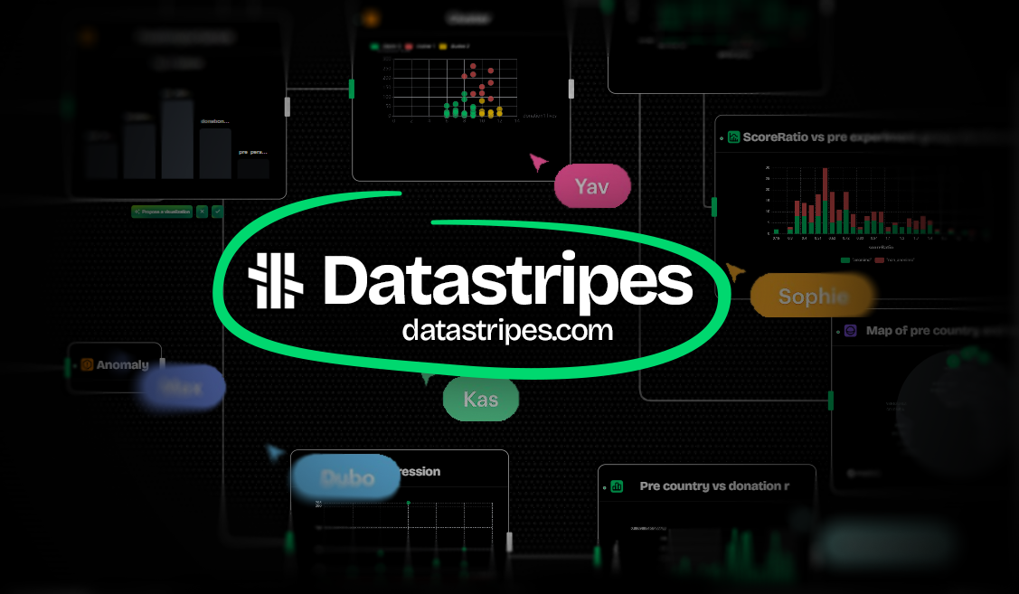
Why Datastripes might win the data race
In the world of data tools, it’s easy to get overwhelmed. So many platforms promise powerful analytics, dashboards, or integrations, but which one really gets you? Which one keeps things simple without sacrificing muscle?
Let’s cut through the noise and see why Datastripes stands out from the crowd, and why it might just be your new best data buddy.
The usual suspects: what most data platforms offer
Before we dive into Datastripes’ perks, here’s a quick snapshot of what you typically get with popular tools like Tableau, Power BI, Looker, and Alteryx:
-
Powerful, but often complex: These platforms pack heavy analytics and visualization features, but often require steep learning curves, complex setup, or coding knowledge.
-
Limited no-code options: Many require scripting or SQL for complex workflows, which can intimidate casual users.
-
Partial cloud or local: Some tools are desktop-only, others fully cloud-based, but rarely both seamlessly.
-
Fewer chart and map options: Standard chart types abound, but customization or exotic charts can be limited or require add-ons.
-
Dashboards but not always easy sharing: Collaboration exists but can be clunky or locked behind enterprise plans.
-
Data connectivity varies: Integrations are good but often require connectors, licenses, or developer help.
Datastripes is the data playground where everything just clicks
Here’s where Datastripes flips the script, making the entire data experience easy, visual, and collaborative, with no heavy lifting.
1. No-Code Workflow Builder, anyone can play
Datastripes is built from the ground up for no-code users. You can drop your data in and get insights in seconds. It’s designed for analysts, business teams, and anyone who wants to explore data without the overhead of coding.
The UI is familiar: a spreadsheet-like interface. But don't worry, the app will handle all the heavy lifting of data transformations, modeling, and visualizations. You can also easily switch to low-code when you want to customize with formulas or JavaScript, but it’s not a requirement to get powerful results.
-
Why it matters: You instantly understand how your data moves and transforms, making troubleshooting and tweaks a breeze.
-
Competitors: Tableau and Power BI have drag-and-drop visuals but lacks of proactivity. Alteryx and Looker lean more on coding or formulas.
2. Istant Data Insights, from raw to ready in seconds
With Datastripes, you can drop your Excel file, connect to a SQL database, or pull from an API and get instant insights. The platform automatically analyzes your data, suggests transformations, and generates charts and tables with AI-powered recommendations.
-
Why it matters: No more waiting for data engineers or wrestling with complex tools just to get a quick answer.
-
Competitors: Most platforms require manual setup or coding to achieve similar results, especially for complex datasets.
3. 30+ Ready-to-Use Chart Types, from classic to cutting-edge
Whether you want classic bars and pies or exotic sunbursts, sankeys, beeswarms, or causal trees, Datastripes has it all, prebuilt and ready to customize.
-
Why it matters: One platform for every visualization need means no hunting for plugins or third-party chart libraries.
-
Competitors: Most platforms cap at 20–30 chart types, often needing extensions for more complex visuals.
4. Simulations, Anomaly Detection, and AI Forecasting, without coding
Datastripes isn’t just about pretty charts. It also offers built-in modules for scenario simulations (like Monte Carlo), anomaly detection, and AI forecasting—all without writing a single line of code.
-
Why it matters: You can explore “what if” scenarios, identify outliers, and predict trends right in your workflow.
-
Competitors: These features are often separate add-ons or require coding in other platforms, making them less accessible to non-technical users.
5. Beautiful Dashboards, flexible, interactive, and shareable
Build interactive dashboards that combine multiple charts, tables, maps, and annotations. Share them with your team or embed anywhere online.
-
Why it matters: Engage your audience with data stories that update live and invite exploration.
-
Competitors: Dashboard building is common, but Datastripes stands out with easy sharing and embedding, no extra hosting needed.
6. 10+ Map Types for Location Insights
From simple pin maps to heatmaps, globes, flight trails, and raster maps, Datastripes offers a rich palette of geo-visualizations for spatial analysis.
-
Why it matters: Get geo insights for logistics, sales territories, environmental data, and more, all within your flow.
-
Competitors: Most platforms offer basic maps only; advanced geo types usually require specialist tools.
7. Fully Local flexibility without limits
Datastripes works 100% in your browser, no installs, no IT headaches, but can also run fully locally if privacy or offline work is your priority.
-
Why it matters: You choose your workflow style and security model without compromise.
-
Competitors: Some tools are desktop-only, others cloud-only, rarely both.
The Verdict: Why Datastripes is a next data tool
Datastripes merges power, flexibility, and simplicity, with every feature designed around ease of use and deep functionality. It’s the perfect blend for today’s data teams who want:
- Fast onboarding with no code
- Full visibility on data
- Stunning visuals from one platform
- AI-powered insight generation
- Hassle-free collaboration and sharing
Whether you’re a business analyst, data scientist, manager, or creative storyteller, Datastripes offers a fresh, friendly, and powerful environment to own your data journey.
Curious to try? Dive into Datastripes and see for yourself how it makes data Easy Peasy Data Squeezy.